

Just answer this question: When was the last time you bought something from a startup? When you were truly among the first 10 to 100 customers? Hard to say, right?
You likely weren’t.
When you used Spotify or Google earlier than your friends, you were among the first millions of users. Notion? Ditto.
Did you ever in your professional career purchase software after a talk with the CEO of a new startup? Or did you go with the industry standard? Or, like most of us, was software bought for us by your superior?
I believe only 1% of our yearly purchases, at best, are from startups.
You are, therefore, asking your potential customer to hop on a journey you have never—or rarely—experienced yourself.
We often compare ourselves to polished journeys
Because 99% of the time, we experience way more polished purchase journeys.
I remember a friend who excitedly told me about such a journey when he went to the gorgeous Apple Store at Leidseplein in Amsterdam. He was received by a host, who asked for his name and entered it into an iPad mini.
The glass spiral staircase of the neo-Gothic building took him to the next floor, where his customised MacBook Pro was sitting ready for pick-up. Within a few minutes, he exited the building happily, even after spending a few grand.
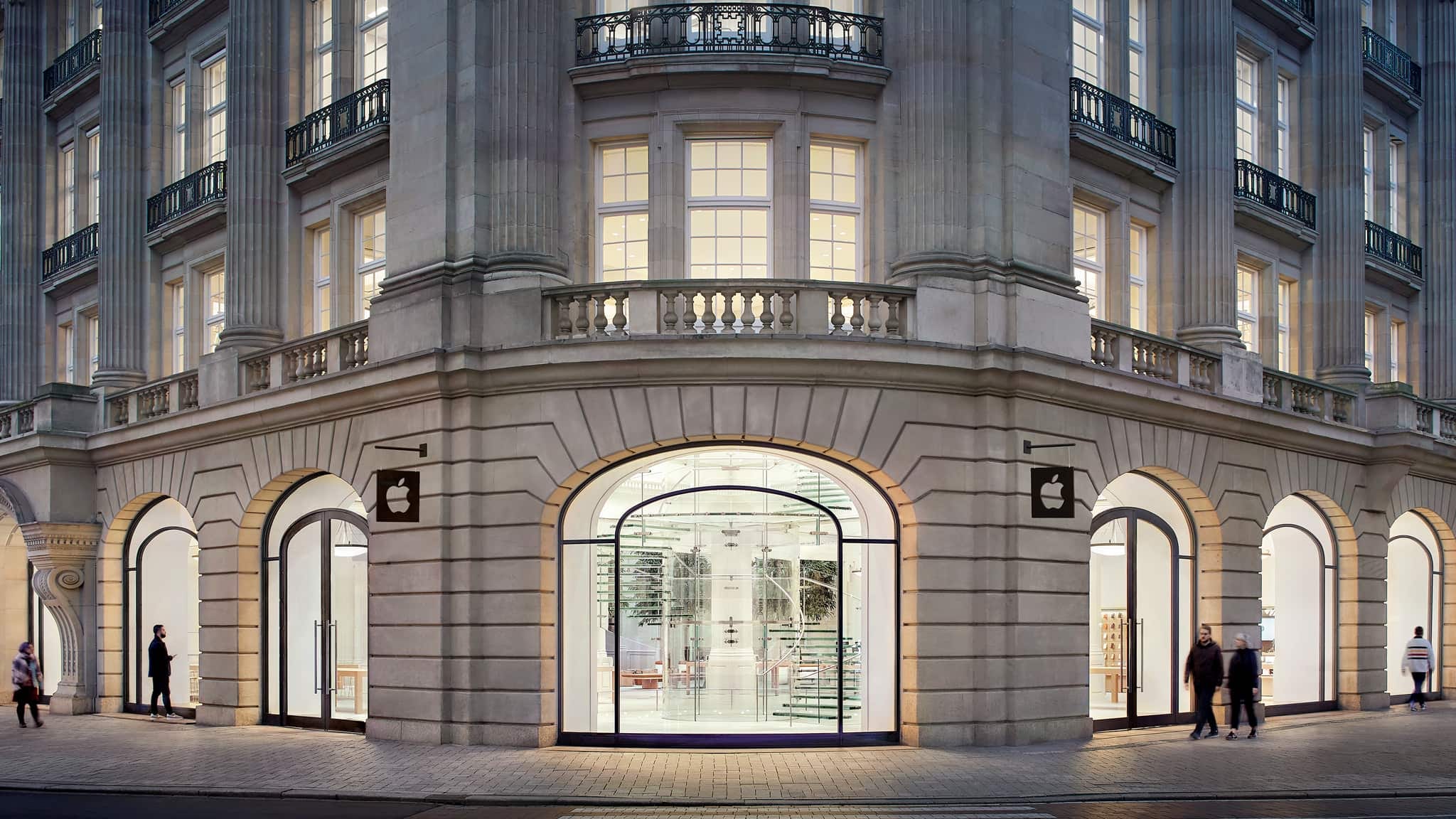
Are you winging your purchase journey?
Apple very deliberately designed this purchase journey. Did you design yours intentionally, or does it just happen? Next to bad segmentation and targeting, this is where founders lose customers.
This is not just about preventing the loss of potential customers, but also about having a slow journey in the first place. Anyone stuck buying you will take focus away from landing other clients.
Map the emotional and mental state to understand the design challenge
Originally trained as a designer, I learned that one of the key aspects is to understand the emotional and mental state of the user. Apply this to your purchase journey.
Emotion: What does the customer feel when they first encounter you?
Mental: What does the customer think when they first encounter you?
Design challenge: What is the minimum thing required to move them forward?
Take Apple's host at the door.
Emotion: A new visitor feels a little unsure, wondering where they should head
Mental: They know they are there for a new laptop
Design challenge: A smooth point of contact to point them in the right direction
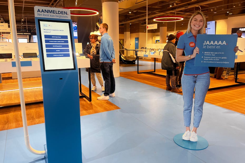
The solution: a host asking for their name and pointing them to the right service desk. That is thinking in baby steps. Coolblue, a Dutch brand, has taken a similar host-based approach in many of their stores, sometimes with a digital variant, to guide people to the right place in the store.
Example #1: How I brought structure to selling
I had an issue with the mentoring service I sell.
I truly believe there’s no step-by-step process for startups; in the weekly mentoring calls, I don’t follow a recipe: the founder brings the problems and insights of last week, and we fix them together. I do bring in points of attention I find important, but that is situational.
How do I sell that? Because, at some point, I was basically saying: “Well, I show up and just wing it”. I experienced pushback because, yikes, who wants that? Point of friction. A clear sign of a purchase journey just happening instead of being intentionally designed.
Let’s apply the three points:
Emotion: Founders feel uncertain about their startup journey to PMF. They come to me to feel more certain.
Mental: They know I do things in a particular way; they are looking for a structure or a framework that captures that.
Design Challenge: How can I explain the structure I bring?
Solution:
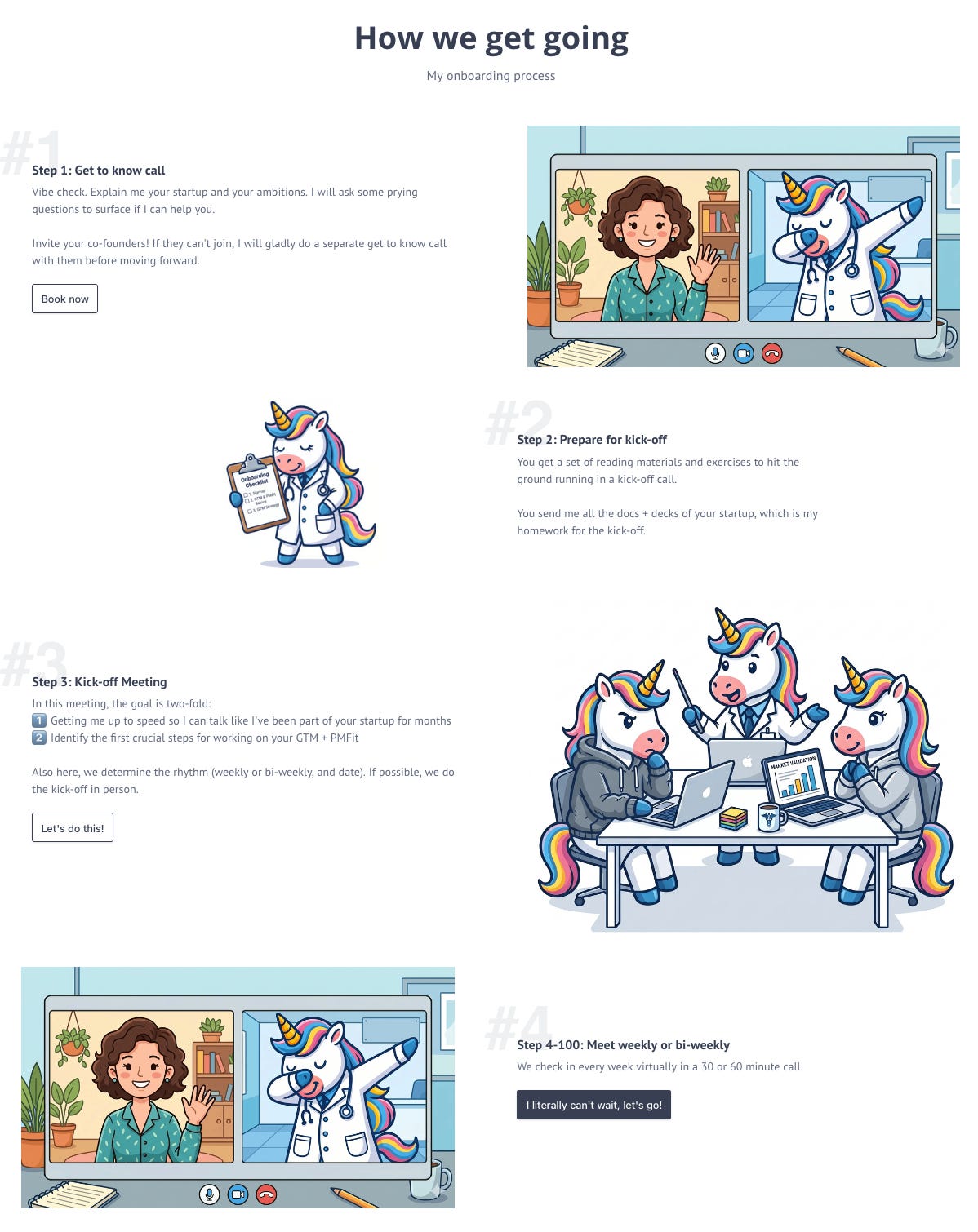
I visualised (see below) my onboarding flow. It explains the structure and provides scaffolding on how to move forward. People generally seem to like this.
I grab my main framework in a sales call to show what topics I will help to address.
My gains:
Sales calls feel smoother
The customer has a much better picture of what they are buying
Therefore, I get a much clearer Yes or No after a sales call
I can’t prove it statistically, but I feel my conversion rate has gone up.
Example #2: Landing the leads
When a client wanted to work with me, I had a set of tasks to do to get them into my system. That improvised approach with required readings, exercises, and administrative tasks was scattered over email, LinkedIn DM, WhatsApp.
A clear sign of the purchase journey just happening. That’s normal, but clients would tell me they get lost in that chaos. Point of friction. They would show up at the kick-off session without having read the required readings, or the subscription was not set up.
Let’s apply the three customer perspectives again:
Emotion: Customer feels overwhelmed because of different touchpoints
Mental: They know they need to do stuff, and want a clear overview of what to do
Design Challenge: Convey everything into a one-stop shop for onboarding
My first prototype was a simple onboarding email. After doing this manually for about a dozen clients, I created a simple Notion page called ‘The Onboarding Checklist’. It has administrative steps, required readings, and exercises.
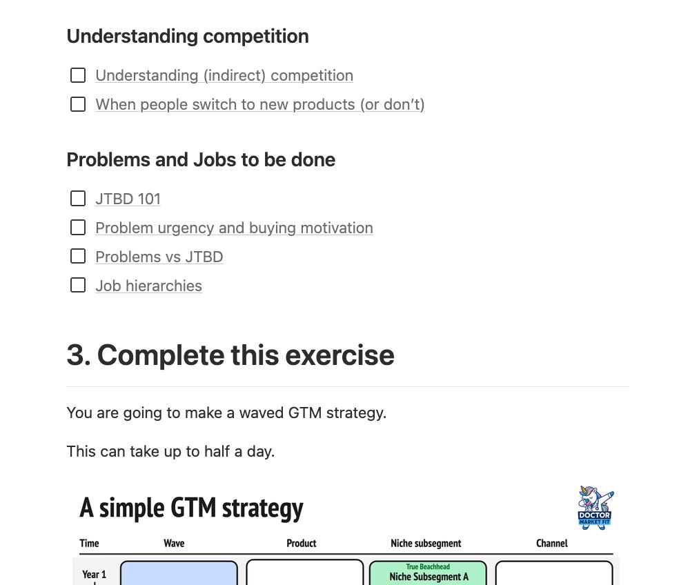
Now I just need to send this one-pager to them, and presto. The results?
90% of clients now show up prepared
Required readings done
Exercises submitted ahead of time
Subscription started on Stripe
Bonus: Clients that don’t manage to finish the onboarding checklist proactively inform me, because they have a clear overview
Result for me: I have better kick-offs because we hit the ground running.
Aim for smooth enough
Because your buyer doesn’t often buy from startups, they will compare you to polished companies they buy from. Therefore, your journey needs to be smooth enough. Luckily, most of the fixes are simple and clear communication touchpoints.
Those three questions turn vague friction into something you can fix. And notice what actually fixed it in my case: not a spiral staircase, but a Notion checklist and a one-page flow. Low-tech, high-reward!
Do you need help with your PMF & GTM?
I have two slots available in the heavily discounted Pony tier.
In some cases, a bit of friction can improve the purchase journey. For example, Amazon hides the "Buy Now" button for high-ticket items and directs users to a traditional cart page so they can double-check the purchase details. So the tricky part is: how do you design a journey with the exact right amount of friction?